
Field Notes: The PMO's View Across Every Project at Once

The dashboard was genuinely beautiful. Twenty-two projects, one screen, a neat row of status dots — and on the morning we saw it, every dot was green. One of those projects was six weeks late.
The dashboard wasn't lying. That's the part worth understanding, because it changes what you do about it. The screen was reporting, accurately, something other than what the director thought she was reading.
Green means “somebody updated it”, not “it's fine”
A portfolio view is a summary of summaries. Each project rolls itself up into a status, and the portfolio rolls those into a picture. Every step in that chain is an act of interpretation by a human being who is busy, who knows the number will be seen by their boss, and who last touched the file at some point they would rather not specify.
So the green dot was accurate about the last update. The last update was five weeks old.
What we keep seeing across portfolios
A handful of patterns show up on nearly every portfolio we walk into, in sectors that otherwise have nothing in common:
Update cadence varies enormously between projects, and the portfolio view rarely shows which ones are stale
“Percent complete” means something different to every project manager reporting it — hours burned, scope delivered, or gut feel
The risk register is the least-loved artifact on any project: written at kickoff, touched again at closeout
Bad news travels slower than good news, and it travels slowest of all in the week before a steering committee meeting
The portfolio inherits the reporting quality of its worst-maintained project, not its average one
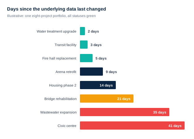
That last pattern is the one that catches people. A portfolio view feels like an average, so a couple of weak projects seem like they ought to wash out. They don't. The entire value of one pane of glass is being able to trust it at a glance, and a single stale project you can't identify poisons that trust for all twenty-two.
None of this is a competence problem, which is why competence-based fixes — more training, a firmer reminder, a stricter template — reliably fail. The people filling in those fields are doing something entirely reasonable: spending their scarce time on the project rather than on the report about the project. Any system that forces that choice will lose it, and probably should.
The fix isn't a better dashboard
Almost every PMO we meet has already tried the dashboard answer: new tool, better visuals, more discipline about the Friday update. It buys a few months. Then the cadence slips again, because the update is still a separate chore bolted onto the end of a week that was already full.
The portfolios that stay honest are the ones where status isn't reported at all. It's derived — from approvals that actually happened, documents that actually landed, milestones that actually closed. When the data is a byproduct of the work, a stale project becomes visibly stale instead of quietly green.
What to do with this on Monday
Don't ask for a better dashboard. Ask one question of the one you already have: for each project on this screen, when did the underlying data last change? Not the status field — the actual work underneath it. Sort by that column and the bottom of the list is your real portfolio risk. It takes about ten minutes to produce, and it is almost always uncomfortable.
It's the same lesson from a different angle every time —we write these field notes from live portfolios most weeks, and the pattern holds across sectors that share nothing else.