
One Chart: Deferred Maintenance and the Data Gap

A school district reports a deferred-maintenance backlog of, say, forty million dollars to its board. It's a big, sobering number - the kind that makes trustees sit up. It's also, quite often, a number nobody can fully defend. Because the condition data underneath it is a mix of a few recent assessments, a lot of aging estimates, and some buildings last truly inspected when the current principal was in grade school.
Deferred maintenance is one of the largest liabilities a public institution carries, and one of the least visible. It doesn't fail on a schedule; it fails on the coldest morning of the year, in the boiler you were going to look at next budget cycle. And the number on the board slide is only ever as trustworthy as the data beneath it. This is a one-chart piece, so let's put the chart first and reason from there.
The number is a stack of confidence levels
When you take a typical deferred-maintenance figure apart, you find it isn't one number at all. It's several very different levels of certainty, layered together and reported as if they were equal. A slice rests on a recent, on-site condition assessment. A larger slice rests on estimates that were reasonable years ago and haven't been touched since. Another slice is institutional memory - what the recently retired facilities manager 'knew.' And some of it is simply a gap, filled with a plausible figure so the total looks complete.
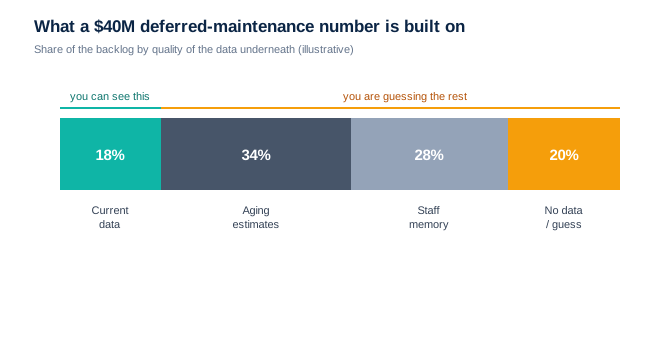
Look at where the certainty actually is. The top slice - current, verified condition data - is usually the smallest. Everything below it is estimate, memory, and outright gap, all rolled up into a single confident dollar figure and carried to the board as if it were measured. When you budget from that number, you aren't budgeting from what you can see. You're budgeting from what you're guessing.
Why the gap keeps widening
Facility condition data decays quietly. A roof assessed as 'good, fifteen years remaining' five years ago is a different roof now, but nobody re-entered the number. Meanwhile new work happens, systems age, small repairs go unlogged, and the record falls further behind the building. The distance between the reported backlog and the real one grows every year - invisibly - until a failure forces someone to finally go and look.
You can't budget what you can't see
The fix here isn't a bigger maintenance budget. It's better data feeding the budget you have. A district that knows the actual, current condition of its assets can sequence spending toward what's genuinely about to fail, defend its number to the board and the public, and stop being ambushed by the boiler. A district budgeting from a stale, half-guessed figure is managing a risk it can't even measure - and quietly hoping the coldest morning holds off one more year.
So tomorrow morning, ask one question about your largest backlog number: how much of it rests on data collected in the last three years? If the honest answer is 'a small slice,' you don't have a maintenance problem yet. You have a data problem - and it's the one to fix first, because every dollar you plan on top of bad data inherits the guess.
A deferred-maintenance number is only as trustworthy as the records feeding it - the same pattern that shows up wherever institutions budget from data they can't fully see. We've charted that trap in other sectorsover on the blog. Fix the data underneath, and the number finally starts telling the truth.