One Chart: Capital Spend vs. Rework Rate
Every dollar of rework was once a dollar of work you already paid for. You pay twice, and the second time is dearer, because now you are also paying to undo the first.
So the obvious question is what predicts rework. Most programmes answer with size: bigger job, more spend, more rework. The chart below plots something almost nobody measures instead, and the shape of it explains more overruns than any risk register I have read.
What the chart shows
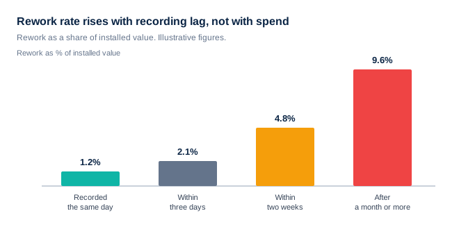
The horizontal axis is not money. It is time, specifically the lag between a decision being made and that decision being written down somewhere a stranger could find. The vertical axis is rework as a share of installed value.
Reading the shape
Three things are worth pulling out of it.
It bends, it does not slope. Going from same-day to three days barely costs you. Going from two weeks to a month is where the line turns nasty. Recording lag is not a linear risk; it has a cliff, and the cliff is somewhere around the point where the people who made the decision stop being able to recall it exactly.
The mechanism is not forgetting. It is divergence. An unrecorded decision does not sit still and wait. It gets relayed, paraphrased, and reinterpreted, and each retelling is defensible on its own. Two weeks later the electrician and the mechanical contractor are both building faithfully to a decision they now remember differently. Somebody is going to tear something out.
Spend does not appear anywhere in it. A ten-million-dollar job that records decisions same-day sits at the left of this chart. A one-million-dollar job that records them a month later sits at the right, paying a rate almost eight times higher on a much smaller base.
Why spend gets blamed instead
Because spend is measured. It is in every report, tracked to the dollar, reviewed monthly. Recording lag is measured almost nowhere, so when rework shows up, the only available correlate is the number everyone already has. Big job, big rework, must be the size. That conclusion survives because the alternative was never on the page.
Bigger projects do have more rework in absolute terms. Of course they do; they have more of everything. But the rate is a different question, and the rate is where the money leaks. Two contractors on the same site, same drawings, same month, can run rates that differ by a factor of five. Size cannot explain that. Lag can.
What to do with this tomorrow
Measure the lag. Not perfectly, and not with a new system. For the next month, on every decision that changes scope, sequence, or a dimension, note two dates: when it was decided and when it was written down where someone else could find it. Take the median.
If that number is under a day, your rework is coming from somewhere else and this chart is not your problem. If it is over two weeks, you have just found the cheapest fix available to you, and it costs no capital at all. It costs somebody five minutes at the moment of the decision, which is the only moment the decision is still free.
The uncomfortable follow-on is that most of what gets called a coordination problem is really a lag problem with better clothes. The rest of the charts make that case one number at a time.